HRCC's new visual identity
Published on 14 March 2023
Horsham Rural City Council has started to introduce a new visual identity for the municipality.
Mayor Robyn Gulline said the previous logo had served the organisation well since 2008, but it was time for Council to move forward and refresh its corporate identity.
“This new brand will improve our image, give us focus and open up a new way forward in promoting our municipality as an attractive place to live, work and invest,” Cr Gulline said.
“It's about creating a new vision and key messages that we can communicate to visitors, families and industries to bring them into Horsham.
“This is more than a logo, its iconic values are aligned to the things that set the Horsham municipality apart from other regions - our geology, agriculture, waterways and soils. The design creates a meaningful and long term legacy for the organisation and the community,” she said.
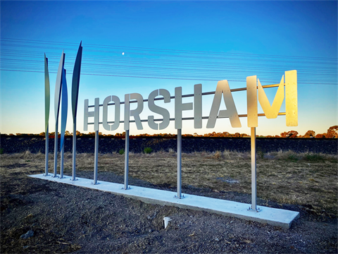
The municipality’s new colours are blue and green, replacing purple, yellow and green.
The new logo’s shapes represent iconic Wimmera aspects such as reeds, crops and yabbies and the typography is inspired by stencilling on the T&G tower and the lettering used on wool bales.
Cr Gulline said Councillors agreed on a plan to fund the project across the next two financial years.
“The switch to the new visual identity will not happen overnight. But we are really excited to see this project roll out further in the coming months and into the future,” she said.
Current Projects: New Visual Identity